PROJECT OVERVIEW
Concept Development
The Xoso Trading concept was built on the idea of “Market Dynamics,” a narrative that channels the precision, volatility, and opportunity of the Forex market. The logo design, with two graphs pointing up and down to form an 'X', perfectly captures this dynamic. The 'X' is the central symbol of our identity, representing the intersection of market trends and the strategic decisions of our investors. Instead of soft colors, we use palettes that evoke the clarity and seriousness of the financial world. With clean compositions and a direct focus on information, the design aims to convey a sense of control and stability in an inherently fluctuating environment, reflecting the brand’s commitment to informed decision-making and strategic investment.
The concept development phase centered on the idea of a “Strategic Flow,” a narrative evoking the bold rise of trends and the calculated interplay between risk and opportunity.
Mood board Creation
The concept development phase centered on the idea of “Structures of Opportunity,” a narrative evoking the strategic movement of trends across dynamic markets. We explored a palette of sharp grays, deep blues, and clean whites to capture the essence of precision and clarity. With inspiration drawn from data visualizations, clear charts, and the composure of an informed decision, the visual direction embodied confidence, strategy, and the strength of smart investing.

Final Result
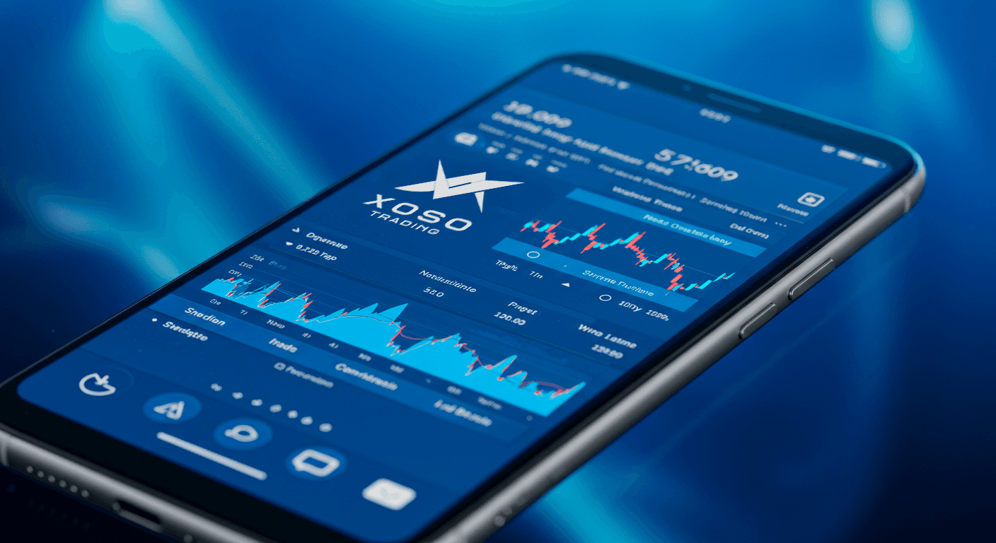
Finally, the art direction was brought to life across all brand touchpoints. Social media assets showcased sharp compositions and clear data visualizations to convey a sense of strategic vision. The corporate brochure features clean data charts and bold typography, designed to reflect the clarity of an informed decision. Even the digital platform experience was built with intuitive interfaces and real-time data visualizations, capturing the essence of time and market movement.
The Xoso Trading brand embodies a strategic approach to design—one that captures the precision and confidence at the heart of smart investing. It’s a reflection of how a clear visual language can illuminate opportunity, blending minimalism and strength to create an experience that feels both professional and deeply empowering.
Client
Xoso Trading is a strategic investment brand that draws from the precise timing of market cycles and the ebb and flow of financial opportunity.
Category
Xoso Trading developed a cohesive aesthetic that merges raw market data and strategic clarity to reflect a precise, data-driven identity.
Timeline
June 2021 - July 2021
Live Project
View Work